Search...
Plugin
Created for
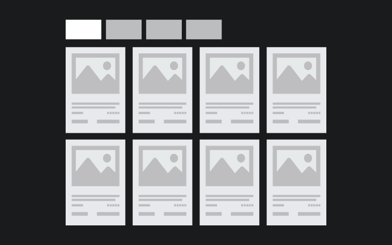
Using this plugin, you will be able to create customized WooCommerce Products Tabs with dedicated products filtered by Products Ids, Categories, SKUs, TAGs, Date range, Products Types etc. settings of each tab and show them on anywhere using Shortcodes.
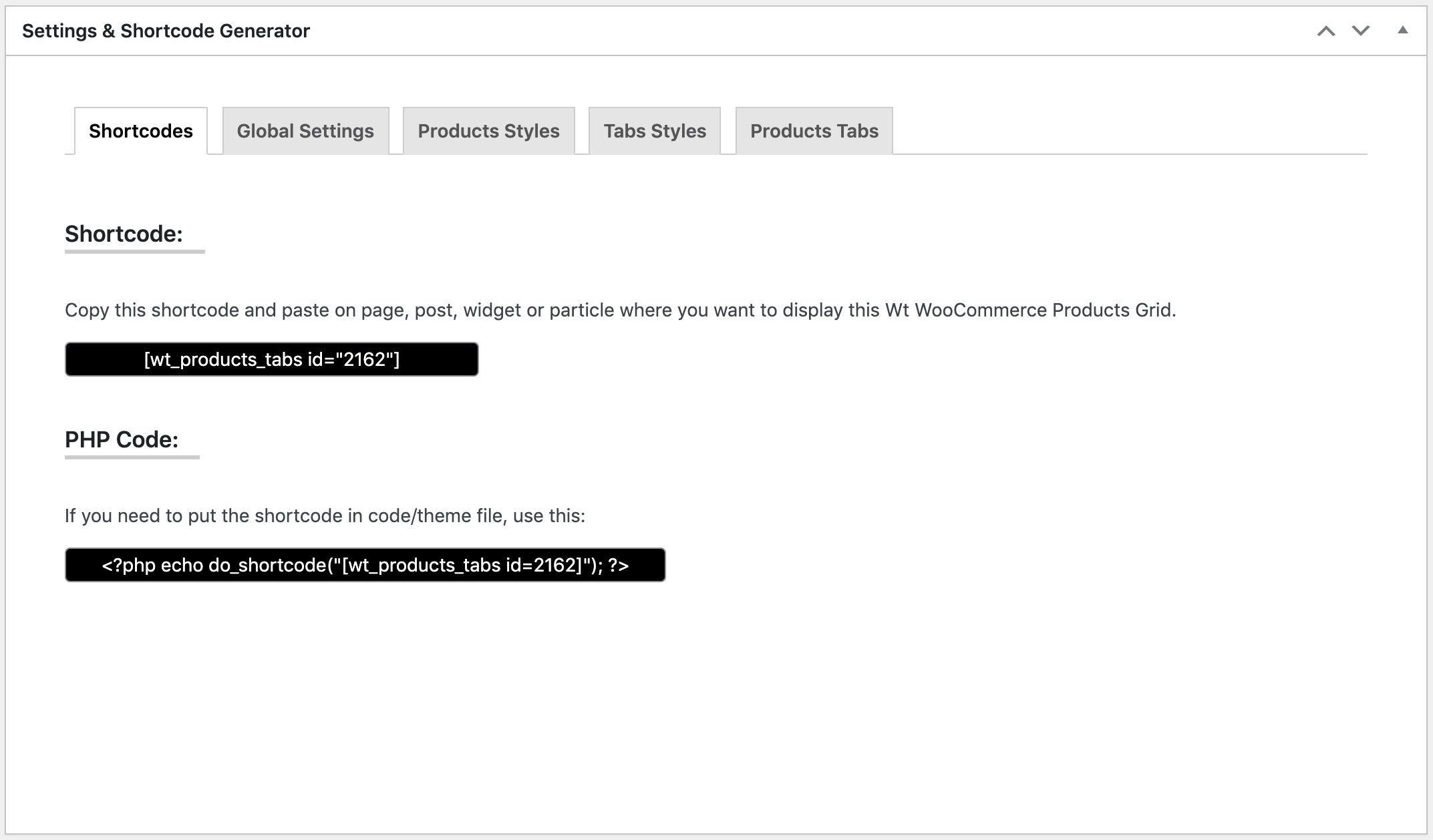
Copy Shortcode showing on this page and paste it on Post/Page/Widget or Gantry 5 Particle where you want to show this product carousel.
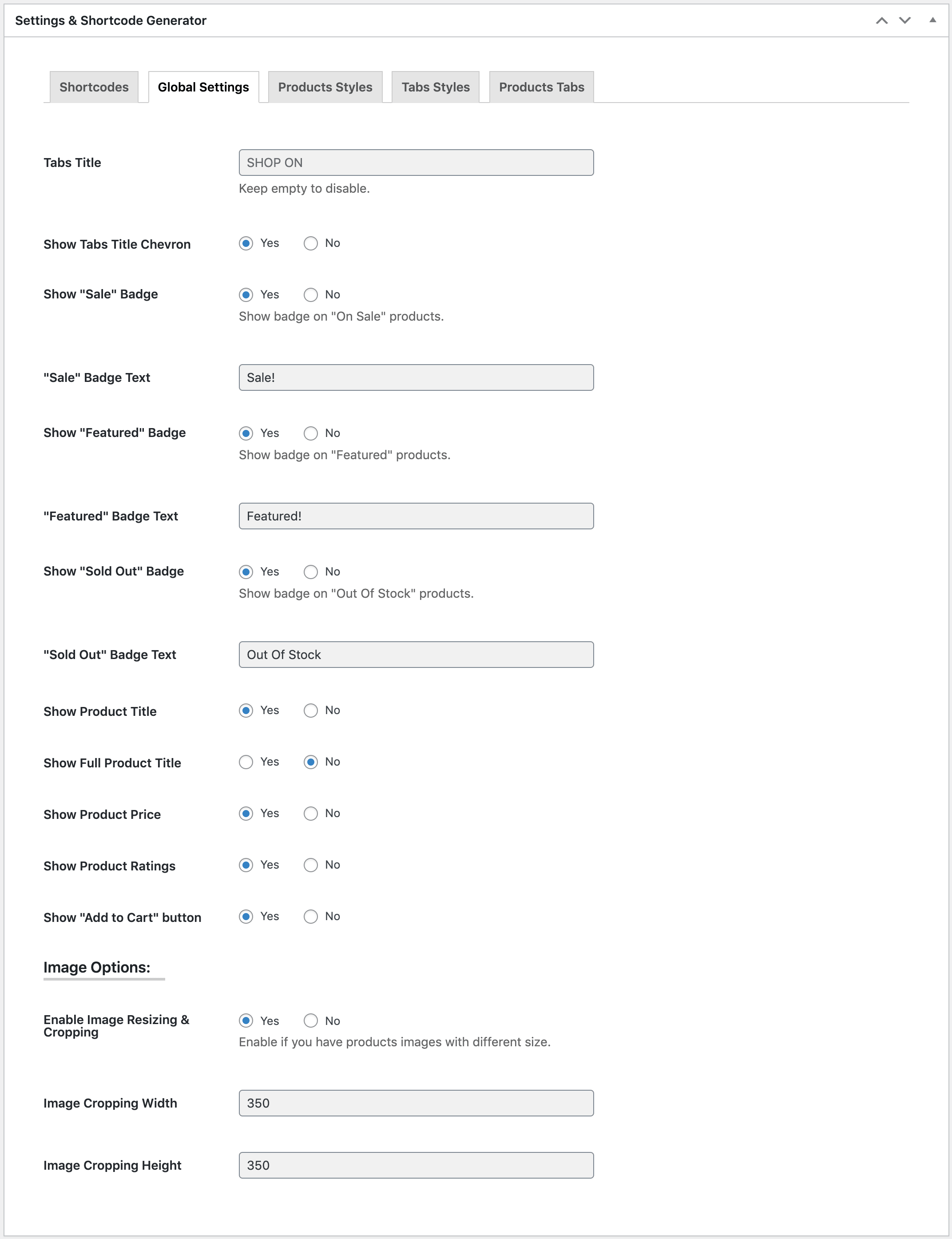
| Global Settings: | |
| Tabs Title | Enter tabs title to show before tabs. Keep empty to disable. |
|---|---|
| Show Tabs Title Chevron | Yes or No |
| Show "Sale" Badge | Yes or No |
| "Sale" Badge Text | Write "Sale" Badge Text. Default: Sale! |
| Show "Featured" Badge | Yes or No |
| "Featured" Badge Text | Write "Featured" Badge Text. Default: Featured! |
| Show "Sold Out" Badge | Yes or No |
| "Sold Out" Badge Text | Write "Sold Out" Badge Text. Default: Out Of Stock |
| Show Product Title | Yes or No |
| Show Full Product Title | Yes or No. If you select No it will truncate long product title in 2 lines (or one line if the browser doesn't support) with ellipsis. |
| Show Product Price | Yes or No |
| Show Product Ratings | Yes or No |
| Show "Add to Cart" button | Yes or No |
| Image Options: | |
| Enable Image Resizing & Cropping | Yes or No. Enable if you have products images with different size. |
| Image Cropping Width | Enter the image width to crop. E.g. 350 |
| Image Cropping Height |
Enter the image height to crop. E.g. 350 |
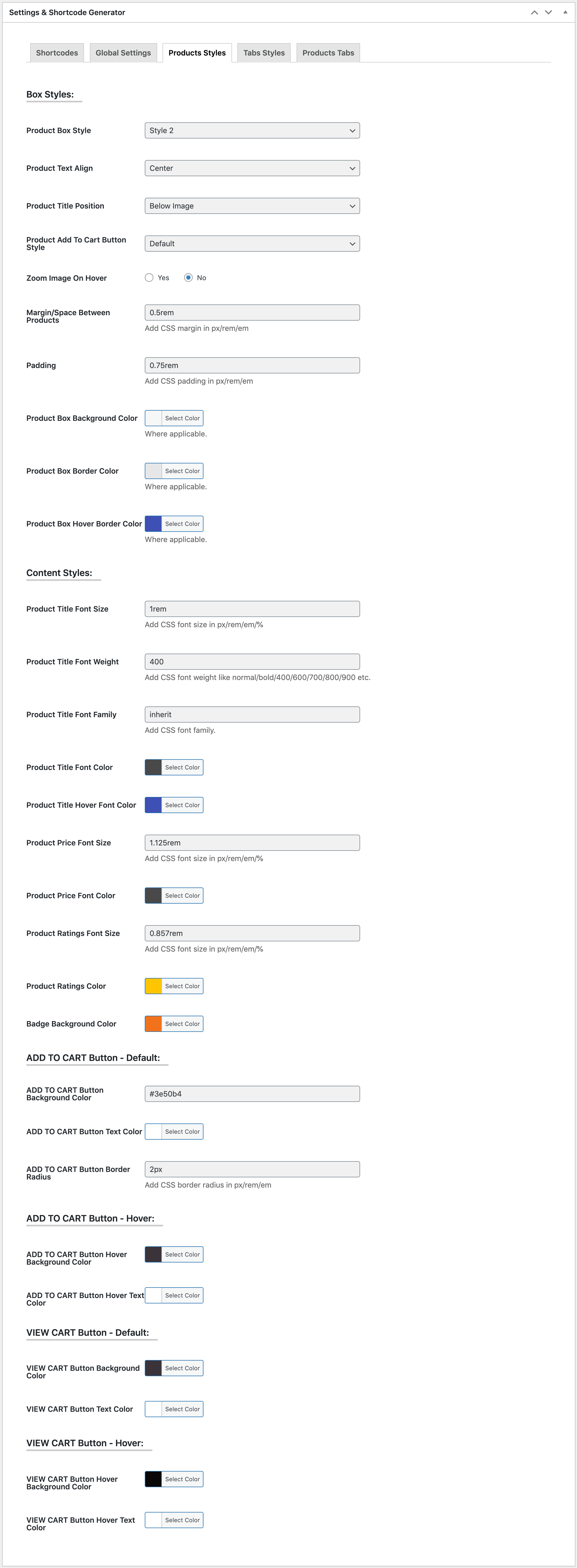
| Products Styles: | |
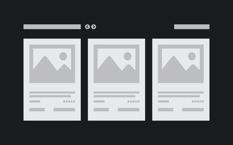
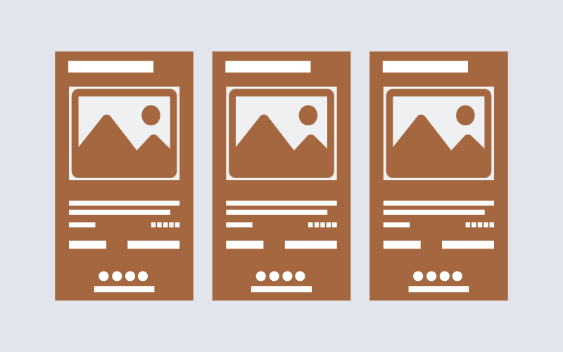
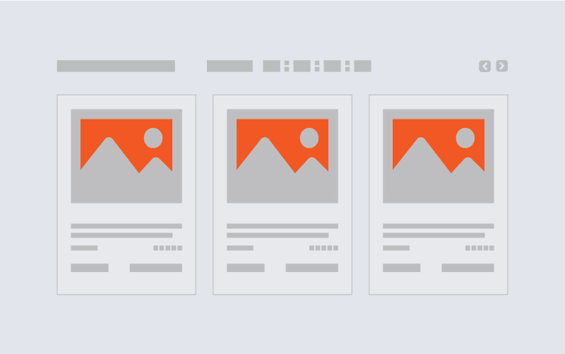
| Product Box Style | Select product box style from 8 different styles. See demo to see their styles. |
|---|---|
| Product Text Align | Choose text align for the product image, title and other options. |
| Product Title Position | Choose whether you want to show the product title above or under the product image. |
| Product Add To Cart Button Style | Select from Default (very bottom), Below Image, Over Image - Left Bottom, Over Image - Left Bottom - On Hover, Over Image - Center - On Hover or Over Image - Bottom Full Width - On Hover. |
| Zoom Image On Hover | Enable/Disable image zoom on hover. |
| Margin/Space Between Products | Add CSS margin in px/rem/em to add space between products. Subject to applicable on selected Product Box Style. |
| Padding | Add CSS margin in px/rem/em to add space between products. Subject to applicable on selected Product Box Style. |
| Product Box Background Color | Choose a color (from color picker) or add a color code for Product Box Background. Subject to applicable on selected Product Box Style. |
| Product Box Border Color | Choose a color (from color picker) or add a color code for Product Box Border. Subject to applicable on selected Product Box Style. |
| Product Box Hover Border Color | Choose a color (from color picker) or add a color code for Product Box Hover Border. Subject to applicable on selected Product Box Style. |
| Content Styles: | |
| Product Title Font Size | Add CSS font size in px/rem/em/% for product title. |
| Product Title Font Weight | Add CSS font weight like normal/bold/400/600/700/800/900 for product title. |
| Product Title Font Family | Add CSS Font family like Arial for product title. |
| Product Title Font Color | Choose a color (from color picker) or add a color code for product title. |
| Product Title Hover Font Color | Choose a color (from color picker) or add a color code for product title on hover. |
| Product Price Font Size | Add CSS font size in px/rem/em/% for product price. |
| Product Price Font Color | Choose a color (from color picker) or add a color code for product price. |
| Product Ratings Font Size | Add CSS font size in px/rem/em/% for product rating stars. |
| Product Ratings Color | Choose a color (from color picker) or add a color code for product rating stars. |
| Badge Background Color | Choose a color (from color picker) or add a color code for product badges background. |
| ADD TO CART Button - Default: | |
| ADD TO CART Button Background Color | Add a color code for Add To Cart button. It's a text field, so you can add rgba(0, 0, 0, 0.4) color code for making the background slightly transparent if necessary. Slightly transparent background color is useful if you selected Over Image - Bottom Full Width - On Hover as Product Add To Cart Button Style. |
| ADD TO CART Button Text Color | Choose a color (from color picker) or add a color code for Add To Cart button text. |
| ADD TO CART Button Border Radius | Add a CSS border radius in px/rem/em/% for Add To Cart button. |
| ADD TO CART Button - Hover: | |
| ADD TO CART Button Background Hover Color | Choose a color (from color picker) or add a color code for Add To Cart button hover background. |
| ADD TO CART Button Hover Text Color | Choose a color (from color picker) or add a color code for Add To Cart button hover text. |
| VIEW CART Button - Default: | |
| VIEW CART Button Background Color | Choose a color (from color picker) or add a color code for View Cart button background. |
| VIEW CART Button Text Color | Choose a color (from color picker) or add a color code forView Cart button text. |
| VIEW CART Button - Hover: | |
| VIEW CART Button Hover Background Color | Choose a color (from color picker) or add a color code for View Cart button hover background. |
| VIEW CART Button Hover Text Color | Choose a color (from color picker) or add a color code forView Cart button hover text. |
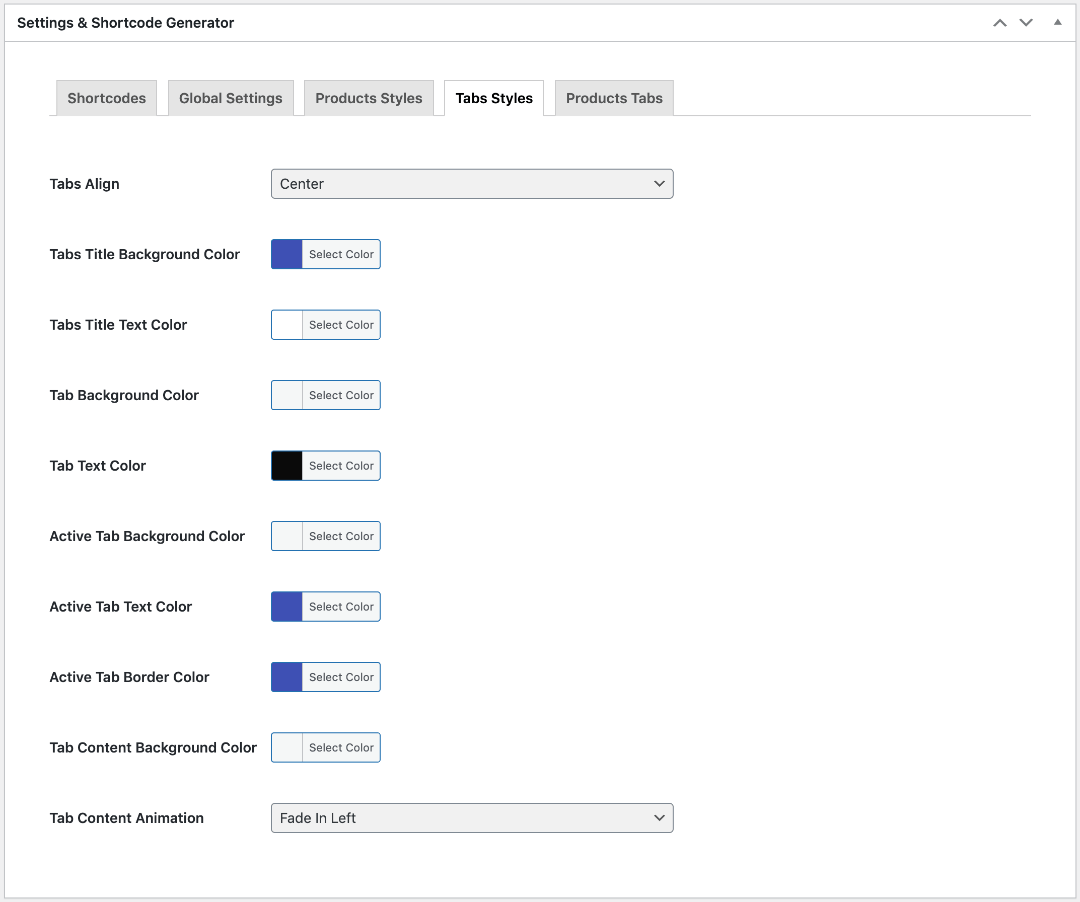
| Tabs Align | Show tabs on left/center or right. |
|---|---|
| Tabs Title Background Color | Choose a color (from color picker) or add a color code for Tabs title background. |
| Tabs Title Text Color | Choose a color (from color picker) or add a color code for Tabs title text. |
| Tab Background Color | Choose a color (from color picker) or add a color code for Tab items background. |
| Tab Text Color | Choose a color (from color picker) or add a color code for Tab items text. |
| Active Tab Background Color | Choose a color (from color picker) or add a color code for active Tab item background. |
| Active Tab Text Color | Choose a color (from color picker) or add a color code for active Tab item text. |
| Active Tab Border Color | Choose a color (from color picker) or add a color code for active Tab item border on bottom. |
| Tab Content Background Color | Choose a color (from color picker) or add a color code for Tab content background. |
| Tab Content Animation | Select tab content animation from Zoom, Fade, Fade In Left, Fade In Right, Fade In Up, Fade In Down, Bounce In Left, Bounce In Right and Bounce In Down. |
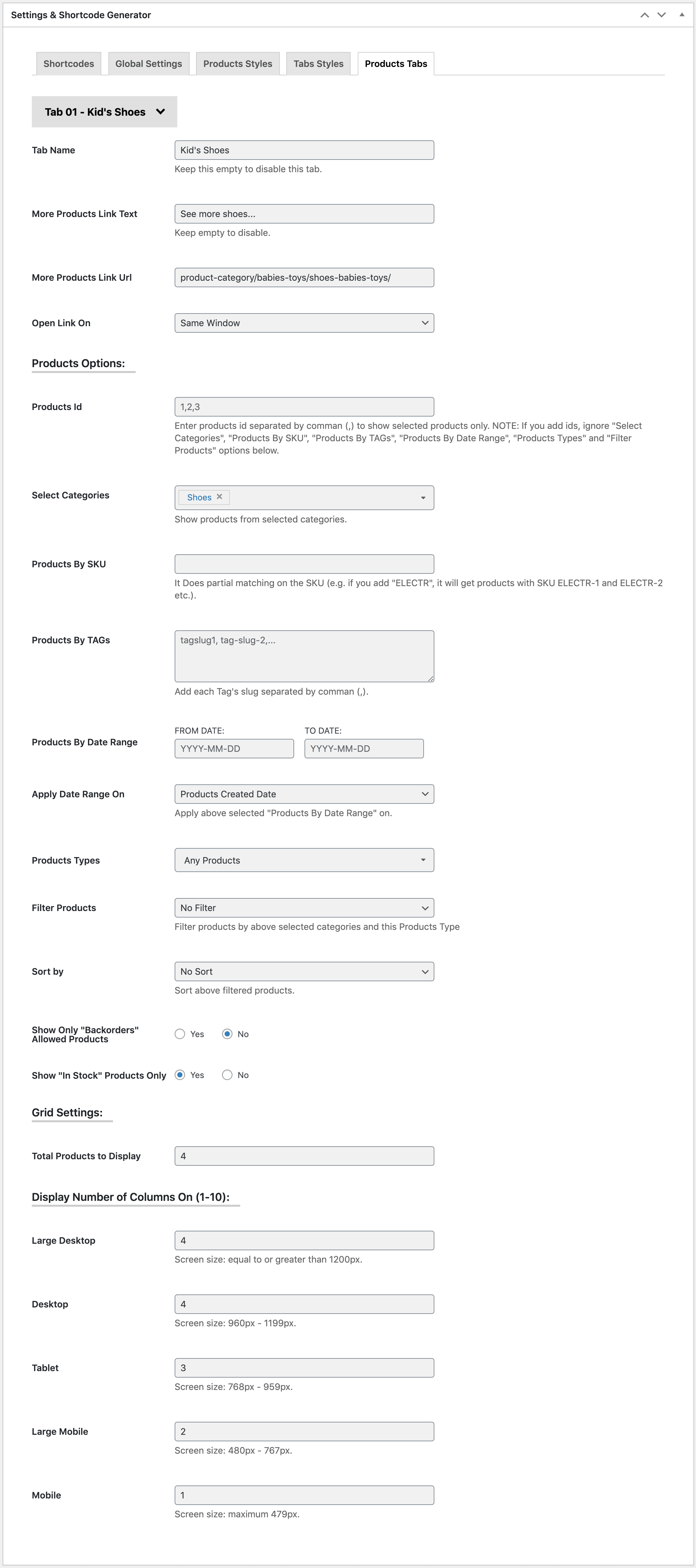
You can show maximum 12 products tabs and an extra Linked tab (without content).
| Tab Name (Select from Tab 01 to Tab 12 or Linked Tab to configure) : | |
| Tab Name | Enter a name for the tab. Keep it empty to disable the tab. |
|---|---|
| More Products Link Text | Add More Products Link Text to show a link under products of the tab, keep empty to disable. |
| More Products Link Url | Enter full URL or page slug to navigate after clicking on the More Products Link Text. |
| Open Link On | Whether open the More Products page in same tab or new tab of the browser. |
| Products Options: | |
| Products Id | Enter products id separated by comman (,) to show selected products only. NOTE: If you add ids, ignore "Select Categories", "Products By SKU", "Products By TAGs", "Products By Date Range", "Products Types" and "Filter Products" options below. |
| Select Categories | Select categories you want to display products from. |
| Products By SKU | If you add ELEC, it will show all products that includes ELEC in their SKU and filter by above selected Categories. It accepts string only, so write only one value. It Does partial matching on the SKU (e.g. if you add "ELECTR", it will get products with SKU ELECTR-1 and ELECTR-2 etc.). |
| Products By TAGs | Add tags separated by comma (,) if you want to show products with specific tag and filter by above options. |
| Products By Date Range | Select FROM DATE and TO DATE if you want show products from specific date range and filter by above options. |
| Apply Date Range On | Select Products Created Date, Products Modified Date, Products Date On Sale From or Products Date On Sale To to apply above selected date range. |
| Products Types | Select one or more option from External Products, Grouped Products, Simple Products and Variable Products if you want to show products from specific products types and filter by above options. Default: Any Products. |
| Filter Products | Select if you want to show only On Sale Products, Featured Products, Virtual Products, Downloadable Products, Sold Individually Products, Manage Stock Products or Reviews Allowed Products and filter by above options. Default: No filter. |
| Sort by | Sort above filtered products by Random Products, Newest Products, Recently Modified Products, Older Products, Best Selling Products, Less Selling Products, Top-Low Rated Products, Low-Top Rated Products, High-Low Stock Products, Low-High Stock Products |
| Show Only "Backorders" Allowed Products | Yes or No |
| Show "In Stock" Products Only | Yes or No |
| Grid Settings: | |
| Total Products to Display | Enter total products to display with the grid. |
| Display Number of Columns On (1-10): | |
| Large Desktop | Show number of products on single slide on Large Desktop view where screen size is equal to or greater than 1200px. |
| Desktop | Show number of products on single slide on Desktop view where screen size is 960px - 1199px. |
| Tablet | Show number of products on single slide on Desktop view where screen size is 768px - 959px. |
| Large Mobile | Show number of products on single slide on Desktop view where screen size is 480px - 767px. |
| Mobile | Show number of products on single slide on Desktop view where screen size is maximum 479px. |
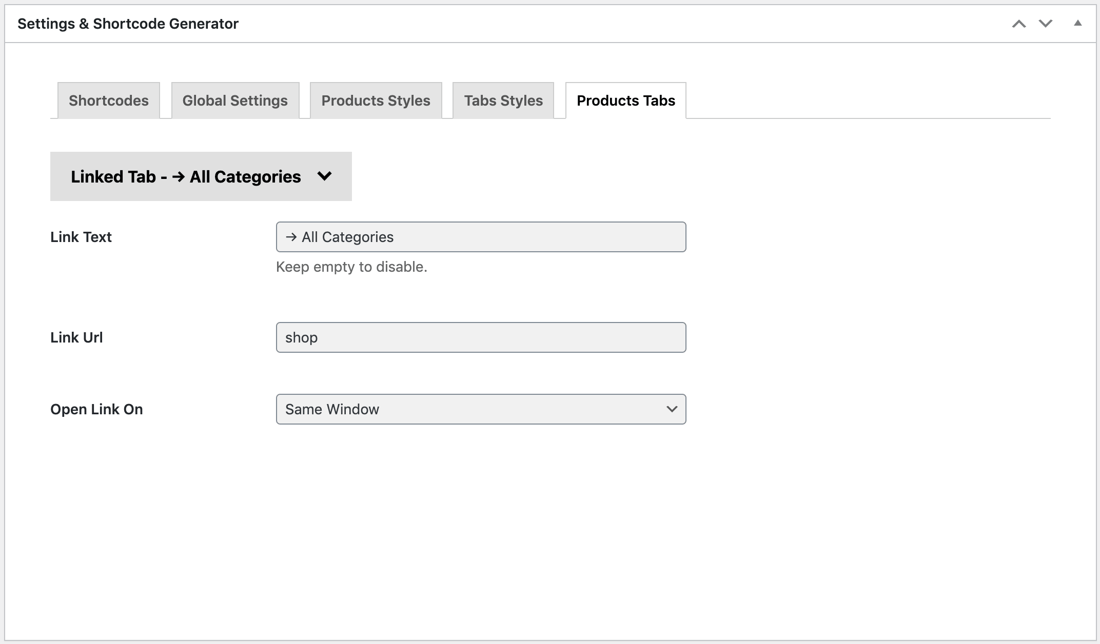
Show an extra tab to linked with another page.
| Link Text | Enter a name for the tab. Keep it empty to disable the tab. |
|---|---|
| Link Url | Enter full URL or page slug to navigate after clicking on the tab. |
| Open Link On | Whether open the linked page in same tab or new tab of the browser. |
Note: We want to ensure complete transparency regarding your purchase of this item. Here's what you should know:
We believe in offering you flexibility and choice. Whether you choose to renew or not, your purchased item remains fully functional. If you have any questions or need further assistance, our customer support team is here to help.
Are you still using the default contact form on your WordPress site?
Give our Guest Support plugin a try – a comprehensive customer ticket support system for WordPress, available for free.
With our Guest Support plugin, it's easy for customers to get in touch with you, and you won't have to worry about tracking customer tickets and responses, as everything can be managed without requiring users to log in or register.